Image: Making Sense
Why is it helpful?
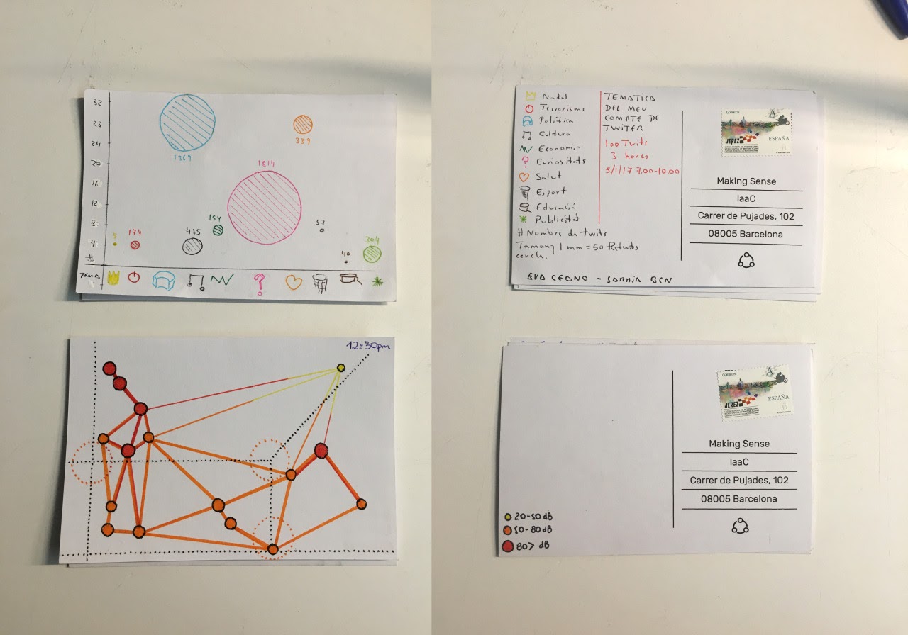
Sometimes you might want to keep track of a variety of data for your own use and enjoyment or share them with people you know and other learners in this course. Some data art projects involve only two people and their own data, such as the Dear Data project, which was designed by two friends, one based in the UK and one based in the US. Each week for a year, the friends collected and measured a particular type of data about their lives, used these data to make a drawing on a postcard, and then exchanged postcards through the mail. The postcards are now part of a 300-page book.
The artist and data journalist Mona Chalabi has also created many data visualisations using resources, such as national governmental statistics and data collected and published by NGOs and research institutions. She has recently been publishing many hand-drawn infographics on COVID-19 to help awareness and individual responses to the pandemic.
These are just two examples which can inspire you to think artistically about data, and show the importance of the Data Postcards tool.
Last modified: Thursday, 15 April 2021, 4:12 PM
