Analysing citizen science data does not have to be different than analysing other types of data. In the previous step, "How to understand and interpret data", we discussed ways that help you gain a clear understanding of your dataset. Here we will provide some tips and suggested tools to help you analyse your data. Offering data visualisations and data analysis tools can help to maintain citizen motivation and interest in the project, while also providing powerful information also for researchers or policymakers. First thing in data analysis is allowing the data to be downloaded and analyzed by the users themselves. Like in the previous step, you can make your data available in several formats: CSV, XLS, KML, or even in more structured ways like the Sensor Observation Service (SOS) or an Application Programming Interface (API). These will help make data available, shareable and interoperable with other data sources. 
WeObserve is looking at ways to share citizen science data with a Community of Practice focused on Interoperability (the ability of computer systems or software to exchange and use information). We can see a example of this in the Ground Truth 2.0 project, where a map browser was created which offers data from the six different observatories in the project from the same access point. In this case, protocols and rules to standardise the data from the Open Geospatial Consortium (OGC) were used to enable interoperability.
Sometimes it is not easy to get a clear picture of the information, and additional analysis is needed so researchers or policy makers can make concrete conclusions and present their findings. In these cases, it helps to ask experts or researchers in the field to make recommendations on the best way to process and present the data. Simple and easy to interpret graphs or maps are always a good option.
Still, using data analysis approaches on citizen science platforms can be challenging because it may require manual or assisted interpretation that doesn’t happen automatically. This might mean that you need to check your data in order to ensure quality control and find inaccurate values or possible outliers. Such wrong values should be removed before analysing, like you would do with any other kind of data. This quality control will also help to avoid or detect a possible systematic deviation in the monitoring process.
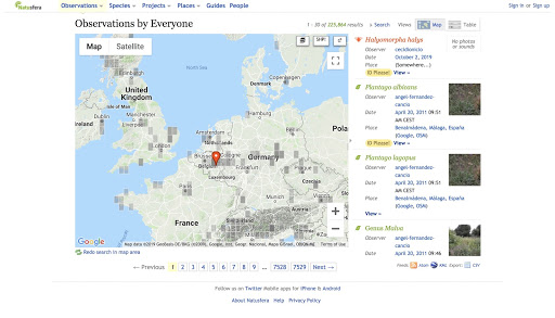
In the last step, we discussed the visualisation of data and how sometimes maps are used to represent the location of the observations. There are many examples out there, for example, the Natusfera platform, or the GroundTruth 2.0 map.
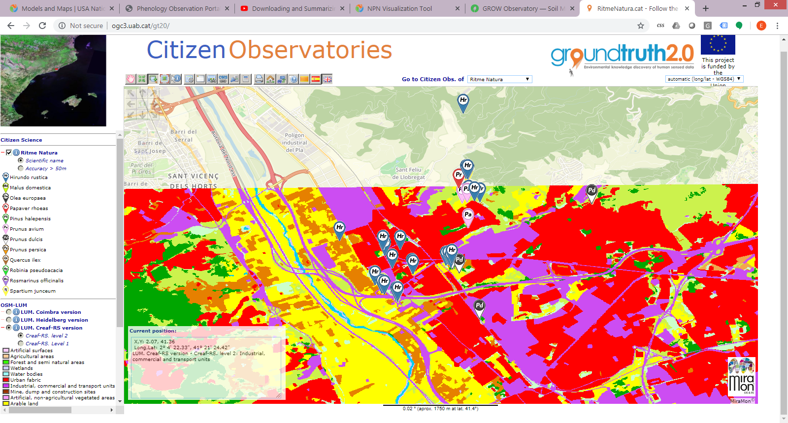
One of the first things you can do when starting data analysis is to use complementary information. For example, you could show the collected observations on a map or combine the data with additional measurements from other sources that can help to explain the distribution or trends of your data. In the image below, for example, you can see observations from the RitmeNatura Citizen Observatory. This shows the seasonal changes of vegetation species in combination with a land use map of the area, which helps in illustrating the kind of environment where those species live. This additional information can help users to find trends in data collected and give a broader information to the single observations.
In the example above, these same observations could be combined for example with other external data about extreme or average temperature if available to help interpret the seasonal changes of vegetation according to climatic conditions . This could be done by cross-referencing the location of the observations with a temperature map or by adding the corresponding temperature to each observation thus obtaining combined information for each data point.

Citizen science observations for seasonal changes in plant species shown in combination with land use information and without it. When combined with additional data, patterns of distribution can easily be detected. ©Ground Truth 2.0 visualisation and data quality tool
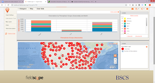
Maps and graphs are easy to create and a helpful way to represent data. When you combine data with additional information, you can easily create visualisations like scatter plots, calendars, activity curves, charts and maps. Graphs can be pre-defined or created by users on the fly (if they can define the data points they want to combine). In the previous step, we mentioned some useful tools have been used to play with data. Here we offer you two more tools that you can use to create map and graph visualisations of your data. Google Maps and Google Charts are cheap and easy tools to help observatories do analysis. FieldScope is a powerful platform that provides mapping and analysis tools for citizen science.

These are map and graph visualisations provided by FieldScope for the BudBurst project. ©FieldScope
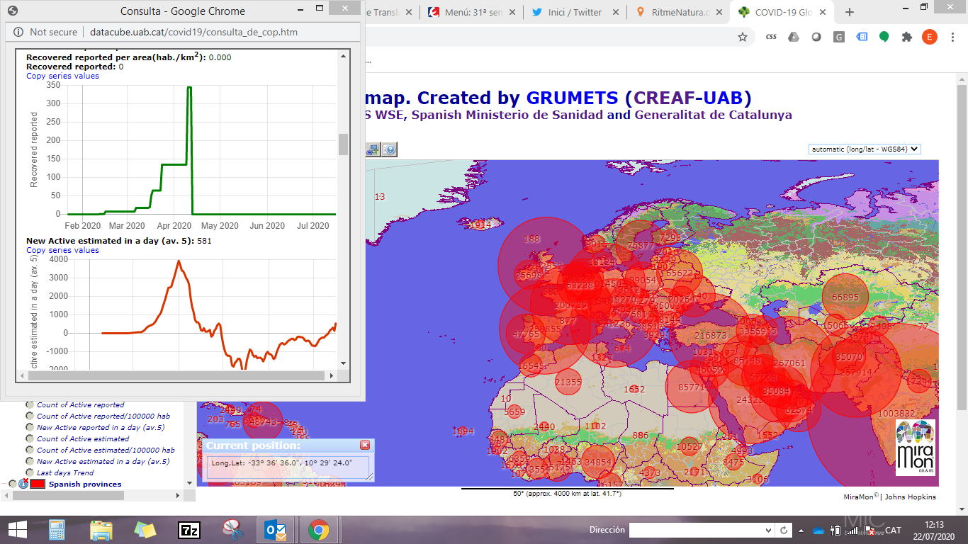
Other examples of data analysis is the COVID-19 datacube created with the MiraMon Map Browser that offers a lot of analytical functions that could also be applied to citizen science data. As you can see in the image, data are viewed in a visual format and several graphs are provided when data are consolidated.
To summarise, we recommend using simple tools for data visualisation and options for evaluating data such as maps, graphs, statistical data, charts, data summaries, and, of course, the possibility to download data for further analysis.

Have a look at the Field Scope Visualisations Page to get a sense of the different options for the way data can be analysed.