Image: Unsplash
Collecting data is really only the beginning of a Citizen Science project! You and your team need to make the data understandable to everyone. If you also want to change policy in your area, simple ways of presenting your data can help policymakers with their decisions. The data you have collected can be described as **raw data**. It is a jumbled collection of data that you need to assemble into information. Using that information and your knowledge, you can tell a compelling story for participants and policymakers.
The GROW Observatory distributed thousands of soil sensors across Europe. Using a mobile app, participants collected soil moisture, temperature and light level from the sensor and sent these data to the GROW servers. Scientists wanted to use those data to validate satellites such as Sentinel-1, but the data also have meaning to the participants at a local scale. One question that might interest us is whether we have an even spread of sensors across Europe. The data looked something like this (only with a lot more rows!):
| PI040307AA4C023725 | 0 | 0 | 20190729 | 20190821 |
| PI040307AA4D026527 | 15.73 | 41.49 | 20190820 | 20190829 |
| PI040307AA4D025864 | 16.43 | 45.81 | 20190730 | 20190814 |
| PI040298AD5I205743 | -8.57 | 38.11 | 20190307 | 20190705 |
| PI040297AD5I209680 | 5.34 | 51.6 | 20190502 | 20190520 |
| PI040298AD5I213339 | -8.59 | 38.11 | 20190325 | 20190720 |
You may notice there is something significant missing here. The columns do not have any titles, so it’s not clear what they mean. In your case, you may understand the data you’ve collected very well, or you may need clarification from someone else in your team.
Take a moment to look at the table and see if you can interpret what data might be in these columns.
The first column looks like a random set of numbers and digits. Perhaps this is a serial number of the sensor? The last two columns, each begins with 2019, could this refer to the year? What about the next four digits? Notice that the middle pair in this column don’t go above eight whereas the last two go up to 29. There are no negative numbers. This could be a date in year-month-day format. Columns 2 and 3 are a bit more mysterious, but if you look at the pair of numbers, you might assume they are a coordinate pair.
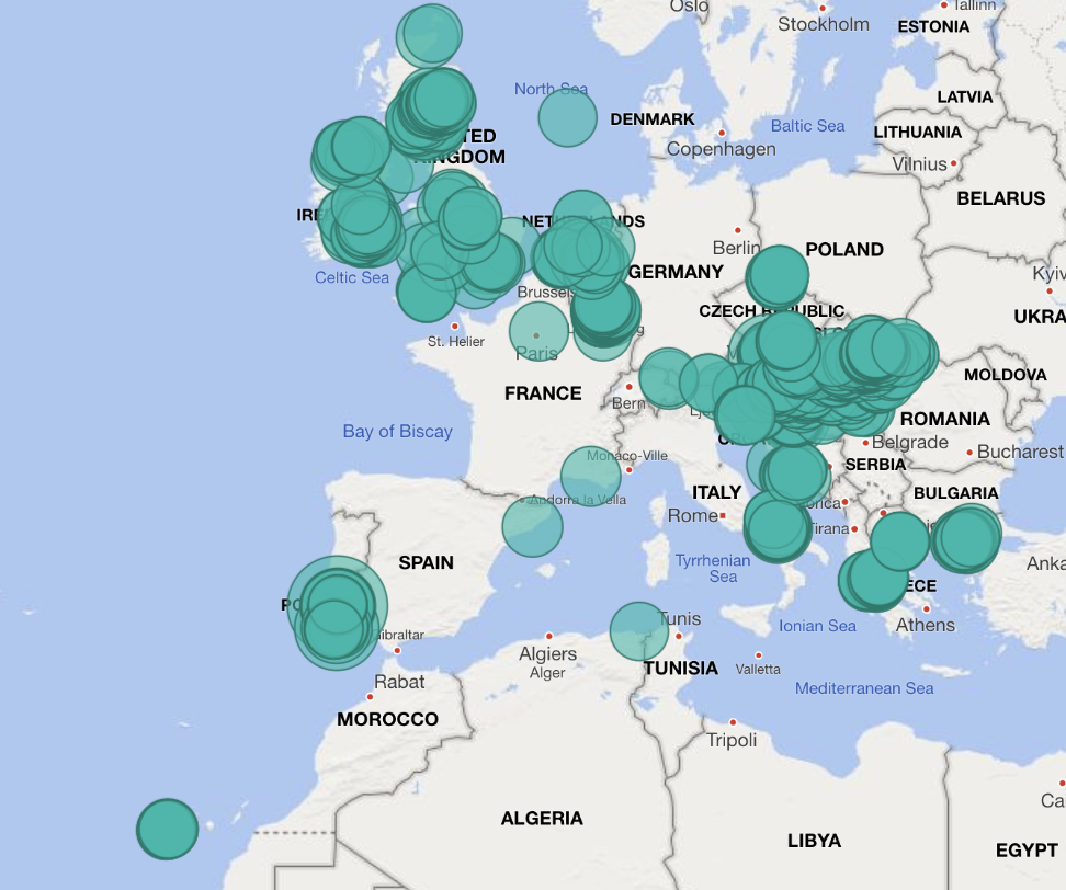
In reality, you will probably know your data well and not have to use this sort of guesswork. But, a table like this means very little to most people, and understanding data in this format is difficult. What we could do instead is visualise the data. We will be going into more detail about this later in the week, but for now, imagine you have a tool you can point at this data and visualise it without much work. There are many tools like this available. Some cost money (such as Tableau, PowerBI, Spotfire etc.) whilst others are free (such as Grafana, Rawgraphs, and Apache Superset). The bottom line is you can quickly produce a map like this one:

In that tool (Microsoft’s PowerBI), we can quickly see if sensors are out of place. When we hover over a circle, we get the sensor count for that location.
This is only one type of analysis. You could, for example, count the number of sensors in a location – some tools, such as Tableau, will help you do this – or tell the tool to display other forms of information from the table, such as those dates above.
If you have been collecting data over time, you may have created what is called a “time series”. You have many readings from a location over a time period. You can use tools similar to the one above to plot these graphs; you can also use tools such as a spreadsheet to get trends over time. You can find out if the data you are collecting is increasing or decreasing in value. Or go further and with simple maths work out the average value over time, or take the average on each day and see if it is increasing.
A compelling technique is to combine your dataset with other public open datasets. Most university projects are obliged to publish their data in a form you can use. Other public bodies (such as local government) may have datasets available too. You might like to try searching the web for these “repositories” as they are known. Here are some of our favourites:
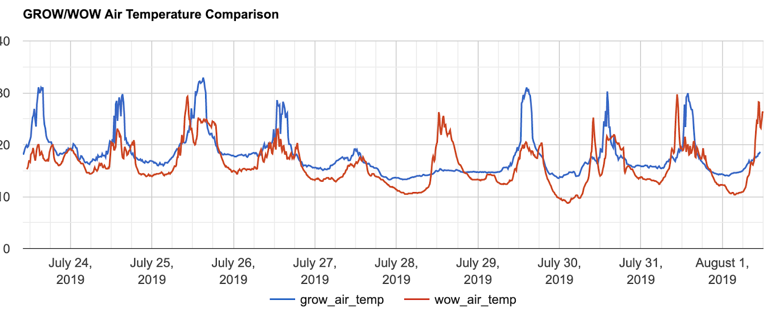
Perhaps you can find air pollution data for your town, for example. In the chart below, we have combined GROW’s air temperature data with temperature data from the UK Meteorological Office. Can you see the similarities? Does something odd jump out at you?
